

Super Crispy SVG Icons
My obsessive, over the top method for designing super crisp icons.

I grew up in the early days of the internet and I love obsessing over tiny digital details.

Last year I helped two dear friends Jean and Edmée with their startup. One of the projects I worked on was bringing more clarity to the structure of their platform. I proposed a new structure to change their 4 main categories to more closely align with the process students follow when finding a job.

This gave me an awesome excuse to design some custom SVG icons for these new categories 🤓
Over the years of designing hundreds of icons I’ve gradually refined my process…
1. Ask The Internet
Usually my first step when choosing any icons is to do a quick Google Search to find out what the rest of the internet expects “word + icon” to look like. In the case of “my plan” the internet seems to think some type of checklist is the way to go.

2. Overall Size & Style
In this case, because they are the 4 main categories for the platform, I feel large 40px square icons work best. This will also give more space for detail that isn’t possible in smaller more action focused icons. The overall aesthetic of the platform is quite spacious and lots of personality — two more reasons to go for larger icons.

3. Rough Drafts
After a few quick iterations I arrived on 4 icon designs that felt about right. I’m always reticent to sprinkle icons everywhere like confetti. I’m a big believer that text is clearest and I try to only add icons if I feel they really add clarity for the user. In this case we’re using them for the main menu top and center in the header of every page — their use feels justifyable.

4. Refining
I’m now happy with the symbols and overall design and aesthetic of the icons, but they’re still a little fussy and aren’t quite balanced. The squareness of the three icons on the left makes them feel bigger than the lightbulb icon. The top of the clipboard is too fussy, the bottom of the lightbulb can be simplified.
I’m always a little wary of design systems that try to standardise things to exact measurements, because a 32px circle will always feel slightly smaller than a 32px square. In order for the lightbulb to look roughly the same size as the other icons it actually needs to be bigger. I describe this as visual weight and it’s definitely more art than science.

After a couple of hours of tweaking, and frequently zooming out to actual size to ensure everything was clear, I arrived at these versions…

I simplified and increased the size of the lightbulb and made the resume and Interview icons slightly narrower. I also used a trick to make the rays from the bulb and question mark slightly heavier to increase their clarity at their default size (40 by 40 pixels). To me these icons now feel more balanced when displayed along side each other. If you’re wondering why the bulb is so close to the top of it’s frame, this is down to how I’ve displayed them here with their frames around them. You’ll see in a minute how it looks right when integrated into the page.
A Side Note About Pixels…
Since the arrival of high resolution screens, pixels are not thought about nearly as much, but they do still matter. As a web developer I learned my craft in the 90s, when most screens had a resolution of 1024 x 768 and you could see the pixels with your naked eye. This blog post by Peter-Paul Koch published in 2010, soon after the announcement of the iPhone 4, had a big impact on how I thought about pixels:
A pixel is not a pixel is not a pixelThe iPhone 4, was one of the first phones to have a high resolution “Retina display”. In his blog post Peter-Paul Koch explores then challenges this would bring for web developers with the measurement a pixel no longer equalling a screen pixel.
5. Pixel Fitting
Once we’re happy with the overall design of the icons it’s time to start fitting the lines as closely as possible to pixel bounds. I’ll use the “Plan” clipboard icon as an example for the next few steps.

It’s hard to see from the comparison above so here is a zoomed section showing how I’ve tried, as much as possible, to move the lines to occupy complete pixels.

One of the benefits of SVG is that they can be resized without the pixels being visible so in order to appreciate the difference here is a comparison with the images rasterized. At 1x it’s easy to see the benefit of moving those lines onto the pixel boundaries. It’s harder to notice the benefit at 2x, but if you look at the curved corners or the check marks that have to cross sub-pixels, they’re noticably sharper after the lines are fitted more closely to whole pixels.

The sharp eyed will no doubt notice other design tweaks. The clip at the top of the clipboard has been simplified, the check marks made larger and the lines spread further apart. As a designer it’s easy to spend too much time zoomed in obsessing over tiny details. As I went through the process of refining the icon I kept zooming out to 100% to try and ensure it was as clear as possible. These tweaks were all made in the interest of clarity.
Aside from clarity there is another hidden benefit to pixel fitting. When you export an SVG file from your design program you’ll often find it includes very precise pixel values. Fitting each line to the pixel grid should round these decimals to, at worst, half pixel values.
6. Preparing to Export
Before we leave Sketch or Figma behind there is one more step – transform the icon into a single path.

This means that the SVG we export is now just one single path. I’ll show later how this opens up some interesting options.

One challenge of exporting your icons as a single compound path is that every single stroke must be the same width. However there is a simple trick to overcome this…

After all this talk about fitting lines and points to exact pixel boundaries, there are always times when we’ll need an element of an icon to be slightly heavier so it is clear. Dots like the one under the question mark, are a common example of this. While SVG can have multiple fills, strokes on different elements. In this case we will completely lose the flexibility to abstract our icons and style them using very simple CSS classes. So it’s important we’re able to export them as a single path.
7. Exporting SVGs
Ok now we’re ready to export our icon as an SVG. Most programs will support this by default, but it typically doesn’t generate the smallest SVG files. Being a Sketch user my preferred plugin is Copy Optimized SVG Code by Sam Chen. Another great alternative is to upload your default exported SVG to Jake Archibald’s SVGOMG which allows you to control which specific optimisations are applied and see if they affect the appearance of your SVG.
Whichever one you choose you’re going to get an SVG file that is significantly smaller than the default.
Here is the progress we’ve made so far…
Original: 1,579 bytes
Flattened: 971 bytes (39% smaller)
Optimised: 417 bytes (74% smaller)
8. Manually Tweaking SVG File
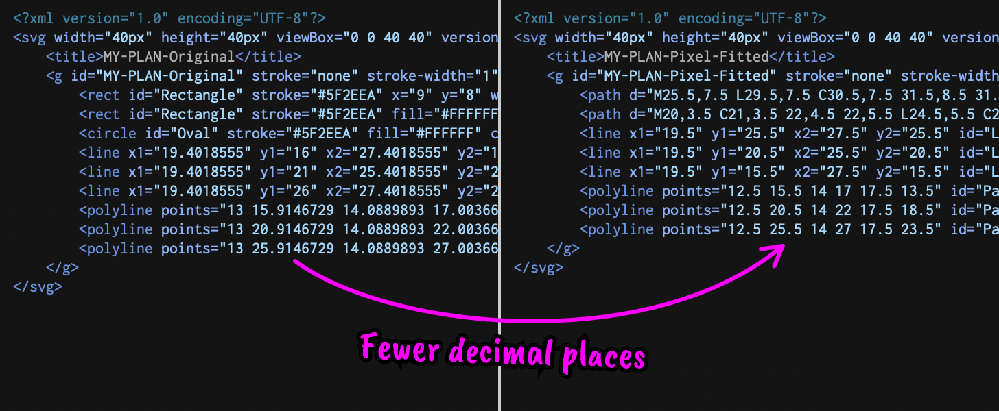
Often even though we’ve done our best to align everything to exact pixels. It’s still worth double checking for pointless decimal places. In my experience even if you place all lines exactly, you often end up with unecessady decimal places in your exported SVG. With icons you shouldn’t need more than 1 decimal place of accuracy.

We also need to change the color value to currentColor — this will allow us to set the color of our SVG files using very simple CSS.
9. Abstract Path Values
In most cases your site will have multiple icons, as does this one. We probably want to display these icons in different colors and maybe even different sizes.
Conventional wisdom about abstraction is to take anything loaded multiple times and load it separately and allow the browser to cache it. The problem here is the overhead of establishing a network connection for each SVG icon quickly negates the benefits. It’s almost certainly better to embed those 417 bytes of SVG icon directly into our HTML document so the user receives the icon as part of the first network request.
Now we get the benefit of flattening each icon to a single path. All of our icons have the same structure. The only part that differs is the “d” value of each SVG path.

I’ve replaced the “width” and “height” values with the single “viewbox” attribute — this will let us easily control it’s size with CSS.
Easy to Abstract Clientside or Serverside
This abstraction can either happen serverside or clientside depending on how your website is delivered to your visitors. I’ve implemented this both in typescipt as part of a single page app (SPA) and also using PHP in a custom WordPress theme.
Lets pretend we’re building an SPA and so rendering our icons clientside. Let’s start by creating an array to store all the path “d” attributes for our icons.

Now we need a render function which accepts an icon name as a string and returns a complete rendered SVG icon.

Finally lets create an icon using our renderIcon function…

There are a few things I like about this lightweight approach:
Returns an SVG Element to which you can easily add additional classes etc.
Easy to control using CSS either via classes or inline styles.
Heavily optimising the icons keeps the filesize low.
Directly embedding in the page removes additional server requests.
I’ve written this example in Vanilla Typescript, but you could easily use a very similar approach in any modern frontend library and retain most of the benefits.
Here is a demo CodePen showing the full effect.
Or checkout the code on Github:
github.com/alexduncan/super-crispy-svg-icons
Epilogue
If you’ve made it this far hopefully you’ve enjoyed this meticulous process to creating SVG icons. Or perhaps you’ve just scrolled to the bottom to comment on how unecessary and over the top my obsessive approach is.
“Just use an icon library/font”
I frequently use SVG icons from libraries like Tabler Icons as a starting point. Then apply the adjustments above to minimise their size and ensure they render crisply at the size I intend to use them.
If you take pleasure in the craft of web development and share my belief that every byte and millisecond counts then hopefully you enjoyed this post.
Like Peter says, mutiply paths and increase the viewBox to get rid of decimals:
https://svg-viewbox.github.io/
Have you ever considered creating your icons at 2x size (80x80 px in this case)? Then you can avoid almost all decimals, saving 2 bytes on most numbers.